| You may preview the completed
stationery by clicking here. If you would like to download all of the
graphics and sound files, please click here.
You may use graphics of your own choice, however please keep in mind that
they (the two main images and the cover) will need to be resized to the
same exact size as those used here for the transition effect or this
stationery will definitely not work as viewed. You may use a
different sized graphic but you will then need to find your own settings.
1. Let's begin
a new scrippy, insert the loading message and then check where it says to
'use a loading message' so that we are not bothered by it every time we
want to do a preview. You can come back when you are done and change
this if you'd like.
2. We need to put in a background,
insert/background and use zebra-bg1.jpg. This needs no other
changes, it does not scroll.
3. Next we will put in a double frame of
black, 10 pixels and place it over the background. Now copy this
frame and insert it three more times. Go to the last frame inserted
and change the style to ridge.
4. Click on insert - container and choose
positioned container. Please set all of the margins over on the
right to 60. You need to check 'set left and right edges' and 'set
top and bottom edges' before you can make any changes there.
5. With the positioned container still
selected, go to insert and insert another frame here. It will go
below and slightly to the right of the container which indicates it is
inside of that container. This is also a 10 pixel double frame
placed over the background and is also black.
6. Click on the positioned container again
and go to insert and put in another background. This graphic is
called zebra-bg4.jpg. It does not scroll and no other changes are
needed.
7. Next we will insert the ticker and the
sound. No matter where you have selected, this will automatically be
placed over at the left margin. Type something in for your ticker
and choose your transition effect. I use the entry style of word
fly-in and exit style of instant, moves per second 120 and characters per
move of 20. This makes my ticker move pretty fast and hopefully
won't wear someone out waiting to see what I have typed in there.
8. The sound file is called
iwant2bu.mid. It is set for continuous play.
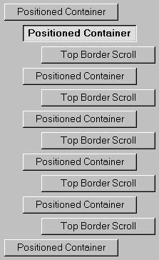
9. The next step is to insert another
positioned container. You can click on the loading message and then
go to insert - container - positioned container. It will be placed
up at the top. Please move it to the very bottom and left margin of your
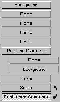
scrippy. Here is a picture to show you where it goes.
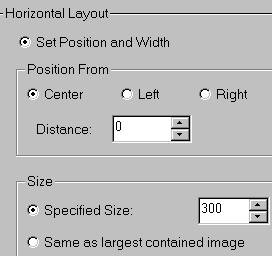
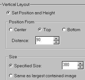
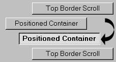
10. This next image shows you the settings for this
container.
11. Make sure that this second container is still
selected and insert - scrolling border - top border scroll. Use the
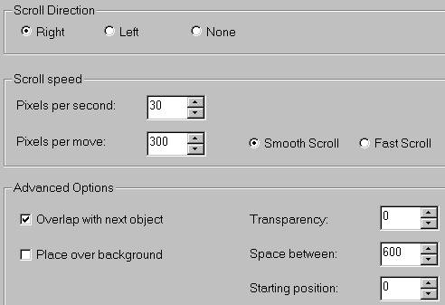
graphic named azebra3.jpg. These are the settings for that scroll.
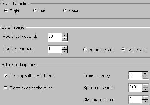
12. We need to insert two more of these top border
scrolls, so let's do the second one. Go ahead and insert it, then use
the graphic named azebra6.jpg. Use the settings as shown below for the
second graphic.

13. Now insert the third top border scroll. The
graphic here is azebra5.jpg and the settings are as shown below.
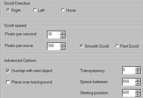
For those of you who still do not understand transitions, I
will explain these settings. First, our space between. The
image is 300 pixels wide and we multiply 300x2 for the space between.
Although you might think since there are 3 graphics you multiply x3 but you do
not. Always use one number less than however many top scrolls you have
to multiply by. That is because the first image is set at 0. Starting
position. The first graphic starts at 0, the second at 300 and the
third at 600, all multiples of 300 except for the first one. By using 0
we signify this one should show up right away. Overlap with next object
is always checked because we do want them to overlap. Pixels per move is
set at 300 because that is the width of our graphic. We want that
graphic to move at the same as it is wide so that it will move out of the way
and let the next picture show in it's entirety too. I set the movement
speed (pixels per second) at 30 because that is the amount of time needed to
let these images change while the black squares are covering that area, as we
do not want the image changeover to show! If you experiment with this
number you will notice that you can 'see' the pictures changing and this does
not go with the design of this stationery. Finding this speed was purely
done by trial and error. In a second attempt, I wanted to use 7
graphics, 30 did not work and neither did any other number I tried. I
gave up because I did not want to spend any more time on it. That
doesn't mean that you cannot use more than 3 graphics, but you will need to
test your speed for the image changes to make sure it doesn't appear while the
blocks are open. You can use two graphics at this speed also.
14. This next section is the first of our black
squares. Once we finish this, you will copy and paste it four more
times, making only minimal changes in distances.
15. Please insert a new positioned container and place
it at the very bottom and over at the left. This means it is a main
container, it will not go under any other containers. Here are the
settings for this container. These are the exact same as used
previously.
16. With that container still selected, insert another
positioned container. This is to be set from the left at a distance of
0, specified size of 60. The vertical is set from the top at a distance
of 0 and a specified size of 76. The sizes indicate the width and height
of our black squares, and these numbers were arrived at by dividing the width
and height of the main image by 5. This means there are 5 rows and 5
columns = 25 positioned containers with squares (top border scrolls).
This picture below shows you what this set of containers will end up looking
like on your scrippy. Notice please that each positioned container sits
under the first one at top, and that they are all evenly aligned with one
another. I left the first container of the second series visible here so
that you can see how the next one will line up once you are ready to copy and
paste.
17. Click on the second positioned container which is
the sub-container and then insert a top border scroll. The graphic I
used is called aaa1.jpg. This is nothing more than a graphic sized 60x76
that is black. Any effect can be done to these squares but I chose to
leave it plain black here.
18. Now, this graphic is at the left upper corner of our
image. All of the top borders are done the same as this one for this
segment! But the containers are different in that for each one we will
move them over to the right by 60 pixels. So container #2 starts 60 from
the left, everything else is the same. Container #3 starts at 120 from
the left, Container #4 180 from the left, and container #5 240 from the
left. Everything else is the same, so you can copy and paste the first
sub-container with it's top border scroll and paste that in four more times,
needing only to change the distance from the left! Notice that all top
border scrolls should go the same way, right!
19. Once you get those done, go to the very first
container of this segment, the main container, select it and go to edit/copy
positioned container. Now paste this positioned container. It will
go under the one you copied, so you will need to move it down to the bottom
and to the left, as shown in the graphic placed here for step #16.
20. Click on the second positioned container as shown
below,
and we will make a few changes to this one that you will
need to repeat in the other four underneath it. This container should be
set from the left at 0, but from the top now we want it to drop 76! That
is, in the vertical layout, change the distance to 76. This means that
this container drops down the height of one of our squares from the top so it
won't cover up the top row of our squares (cover). The second container
is 60 from the left, that is the width of our cover, and again is 76 from the
top. Container #3 is 120 from the left and 76 from the top, container #4
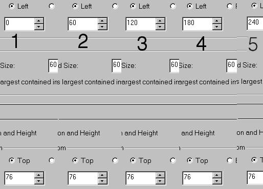
is 180 from the left and 76 from the top. Container #5 is 240 from the
left and 76 from the top. Do you understand this? These top border
scrolls all scroll left!
21. I hope so :-) Now we want to copy and paste
again! Move this one down and to the left just as you did the last
segment of containers. This will be the third row of five. These
top border scrolls go right this time.
Container #1 is 0 from the left, and 152 from the top.
Container #2 is 60 from the left, 152 from the top.
Container #3 is 120 from the left, 152 from the top.
Container #4 is 180 from the left, 152 from the top.
Container #5 is 240 from the left, 152 from the top.
22. Paste these containers again! They scroll left
and here are their settings.
Container#1 - 0 from the left and 228 from the top.
Container #2 - 60 from the left and 228 from the top.
Container #3 - 120 from the left and 228 from the top.
Container #4 - 180 from the left and 228 from the top.
Container #5 - 240 from the left and 228 from the top.
23. We need one last row of the covers for the
bottom! Paste this segment one more time :) Scroll these right.
Container #1 - 0 from the left and 304 from the top.
Container #2 - 60 from the left and 304 from the top.
Container #3 - 120 from the left and 304 from the top.
Container #4 - 180 from the left and 304 from the top.
Container #5 - 240 from the left and 304 from the top.
24. Shew! That's a lot of containers huh? Do
a preview and save your ssc if you already haven't, you don't want to have to
redo this one over!
25. All we need now is a message area. Insert this
and make sure it falls at the very bottom and over at the left margin.
This doesn't go inside of a container! Set the left and right margins to
90. The top is 450 and the bottom is 60.
26. Gee, you are done! :-) Hope you enjoyed making
your own transition :) Feel free to change these graphics but keep them
the same size for trouble free use!
Index -Tutorials
Index |